Visualize temporal sound data in D3.js

Executive Summary

Orcasound , let by Dr. Scott Veirs, is an organization based in Washington working on apps to listen live to whales through hydrophones (sea speakers) and visualization of sound data. While looking for more data visualization opportunities to contribute to, I immediately took interest in this project due to its goals to learn more about biomarine patterns of precious yet endangered orcas.

Goals

Orcasound’s mission is to detect biomarine patterns using sound data transmitted from hydrophones placed at Bush Point. The data is stored in CosmosDB and then annotated by human or machine (source: Data visualization opportunities · orcasound/orcadata Wiki (github.com)). My goal is to collaborate actively with the team to design, iterate and implement a visualization that is visually clear and accessible.

Challenge

The challenge of the dataset is to visualize a short timestamp observation among a long period of time. The data consists of over 3000 observations of 60-second durations collected at each minute-length timestamp. The timeline of the dataset ranges from September 2020 to September 2021.

One observation consists of timestamp, location (all are from the same hydrophone area), and 60 second duration in the predictions property.

Toggle to see data point
                        
    [{
        "id": "464e0e81-ba53-4894-bf44-fa65b338d826",
        "modelId": "FastAI",
        "audioUri": "https://livemlaudiospecstorage.blob.core.windows.net/audiowavs/rpi_bush_point_2021_04_16_07_19_14_PDT.wav",
        "imageUri": "https://livemlaudiospecstorage.blob.core.windows.net/spectrogramspng/rpi_bush_point_2021_04_16_07_19_14_PDT.png",
        "reviewed": true,
        "timestamp": "2021-04-16T14:19:14.629478Z",
        "whaleFoundConfidence": 64.46377411484718,
        "location": {
            "id": "rpi_bush_point",
            "name": "Bush Point",
            "longitude": -122.6039,
            "latitude": 48.03371
        },
        "source_guid": "rpi_bush_point",
        "predictions": [
            {
                "id": 0,
                "startTime": 44.7457627118644,
                "duration": 1.0169491525423728,
                "confidence": 0.5313302651047707
            },
            {
                "id": 1,
                "startTime": 53.89830508474576,
                "duration": 1.0169491525423728,
                "confidence": 0.6244806498289108
            },
            {
                "id": 2,
                "startTime": 55.932203389830505,
                "duration": 1.0169491525423728,
                "confidence": 0.552818275988102
            },
            {
                "id": 3,
                "startTime": 56.94915254237288,
                "duration": 1.0169491525423728,
                "confidence": 0.8699217736721039
            }
        ],
        "_rid": "cp0tAOsNIHcsBgAAAAAAAA==",
        "_self": "dbs/cp0tAA==/colls/cp0tAOsNIHc=/docs/cp0tAOsNIHcsBgAAAAAAAA==/",
        "_etag": "\"0400fec6-0000-0800-0000-60799ddd0000\"",
        "_attachments": "attachments/",
        "SRKWFound": "no",
        "comments": "sea bird",
        "dateModerated": "2021-04-16T14:23:25Z",
        "moderator": "live.com#dbaing17@gmail.com",
        "tags": "",
        "_ts": 1618583005
    }]


With observations ranging from September 2020 to September 2021, to visualize 60-second duration in a long period of time (even in one day, the data points might already have overlapped), I focus my goal on making the visual presentation as clear as possible, but still provide enough information of the detections.

Dataset and first thoughts

Since each 60-second duration is very short, my first thought is how to visualize it in a way that is visually accessible and visible.


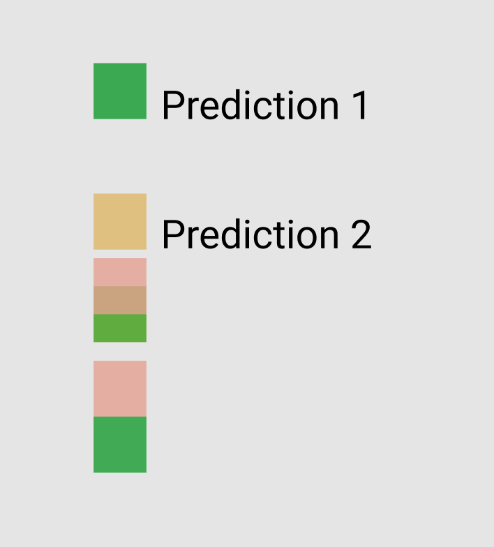
I tested out by color coding each duration in the 60 second duration and have the predictions lined up vertically. However, there are some caveats to this:


  1. The rectangular stacking up would make it hard to differentiate between two datapoints
  2. There is accessibility concern for choosing the colors to reflect confidence level in each observation (more on this)
Square datapoints might cause elements to stack up

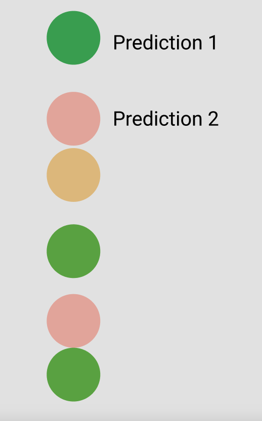
I then thought, what if I turn the predictions into circles, so the edges don’t stack onto each other. There, so much better!

Using round data point instead of rectangular

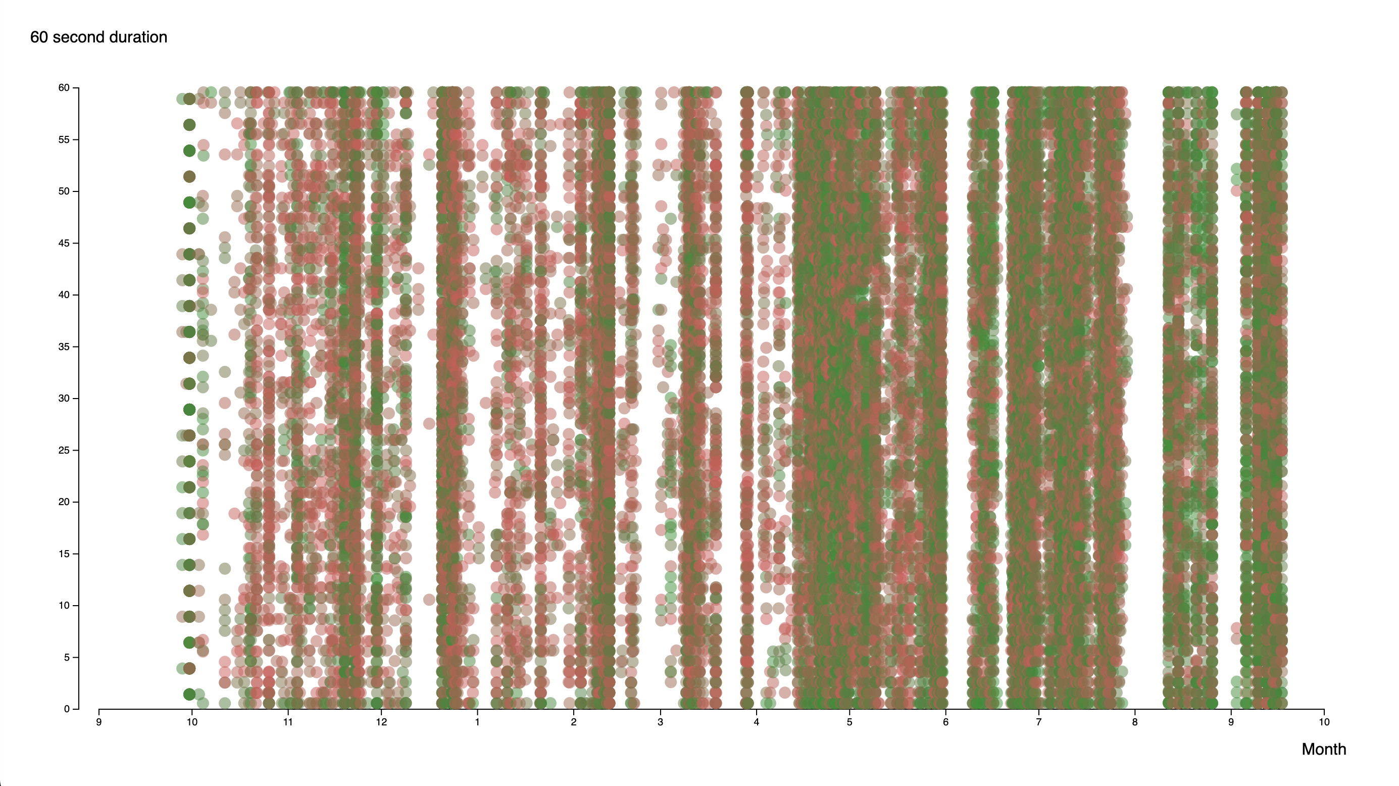
I try a quick prototyping by plotting out each observation according to their respective dates. And oh my, look how this turn out!

Even though the chart capture the spirit of the 60-second duration, since each timestamp is so close to each other (only a minute or more apart), plotting it by days is not very helpful.

Revamping and input from the team

Dr. Scott Veirs put forth some questions that we can try to answer with the current dataset:

  • Are there any diurnal patterns in SRKW call events? How about call events with or without echolocation clicks?
  • At what time of day and in what seasons are the songs/calls of pigeon guillemots heard on the Bush Point (and maybe Port Townsend) hydrophones? An extra challenge would be to also look at the detection rate as a function of tidal height (under the supposition that we may be hearing them most often when the hydrophone is closer to the sea surface)?

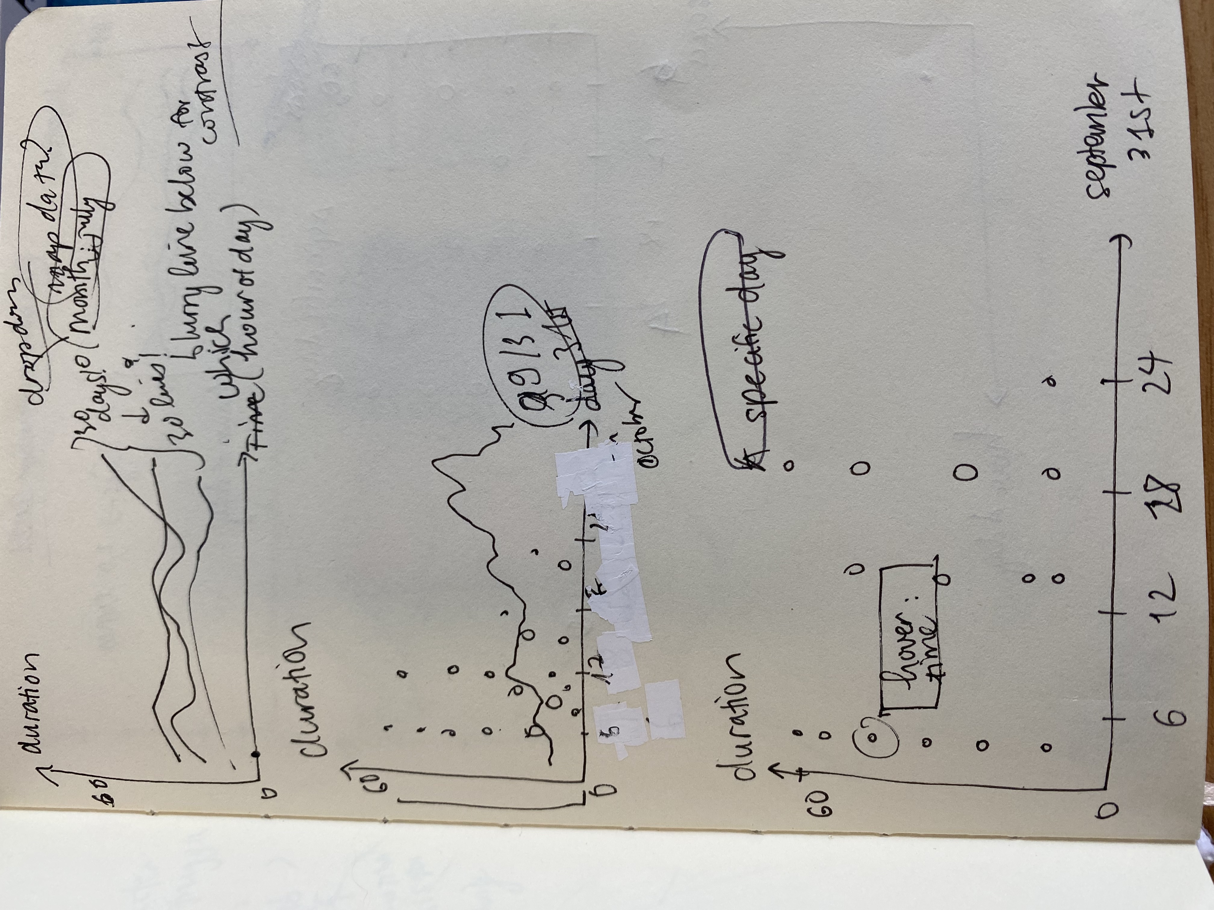
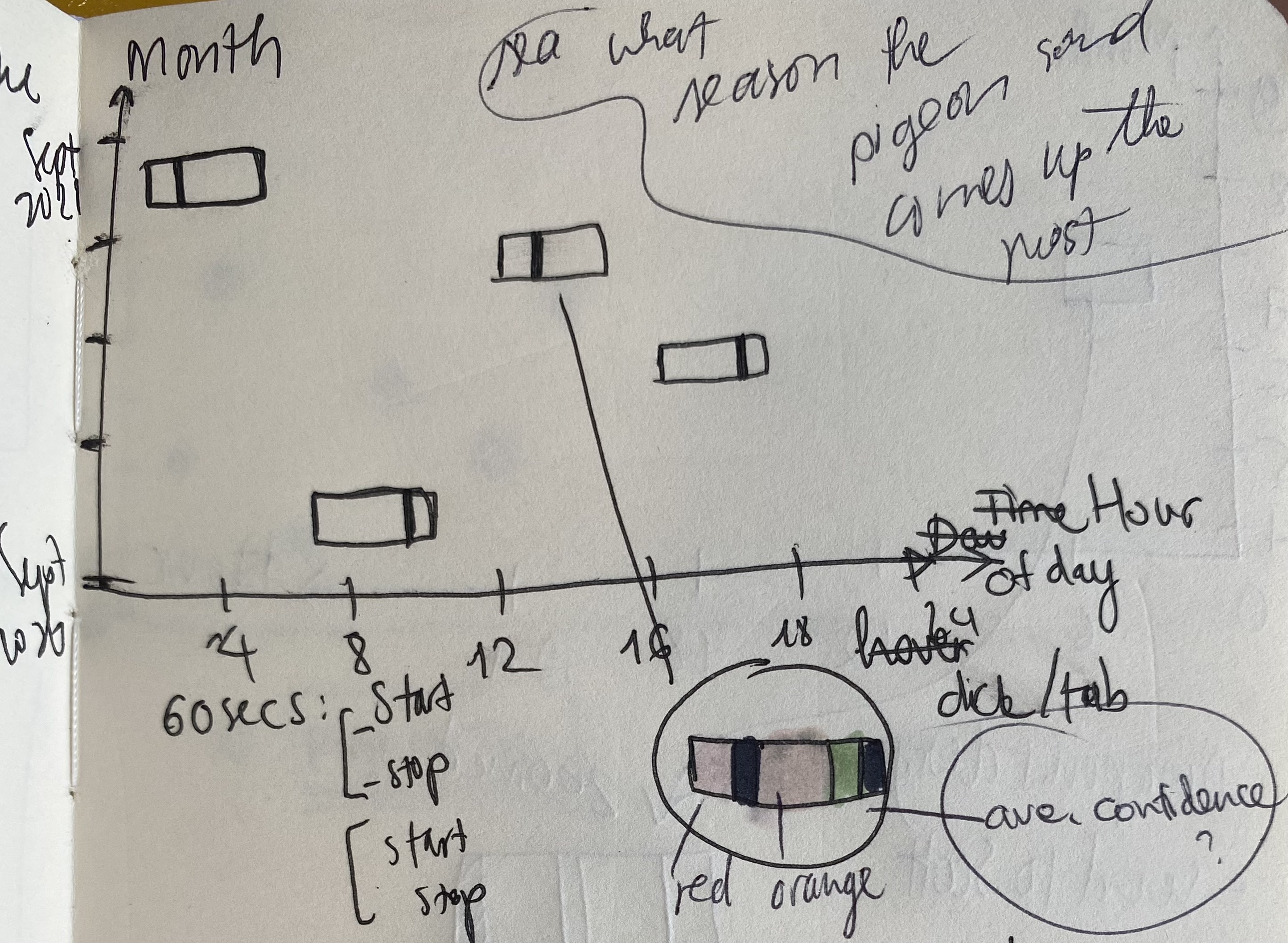
For this project, I choose to tackle visualizing the diurnal pattern and the time of day where the sounds of pigeon are heard. The first thought is to let users choose specific days and still plot out the 60 second duration. With the questions put forth above from Scott, I consider the following features important to include:

  • The hour of day that a sound duration is observed
  • The ability to filter out data that is tagged “Pigeon” or “Pigeon Guillemots.”

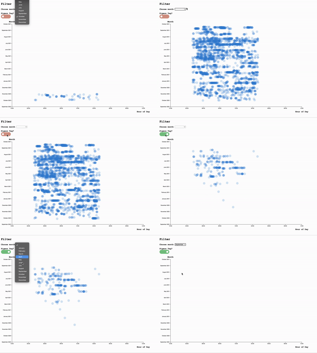
Explore ways to visualize 60-second observations by filtering out days/times

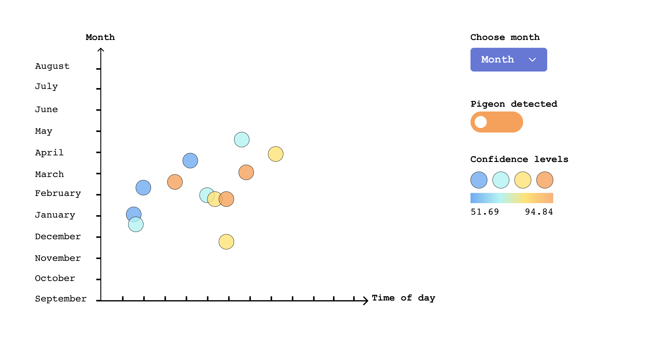
However, having only one date plotted on the chart might not make it easy for compare and contrast and see diurnal patterns. With that, I came up with the idea to put the hour of day on one axis and the month of the observation on another axis. This way, the user can see the day/month patterns very clearly, fitting for our purpose of detecting seasonal/dirunal biomarine activities.


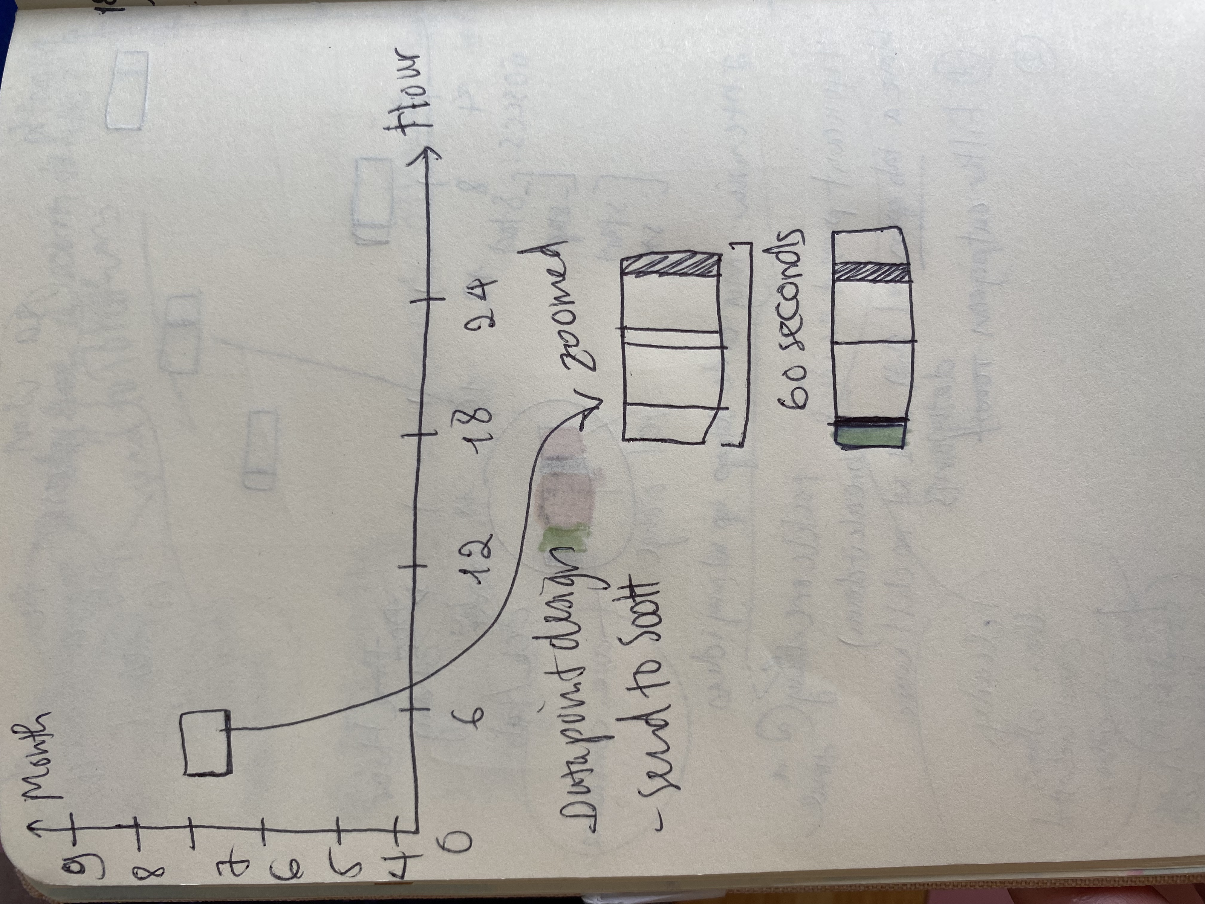
Instead of plotting out the whole 60 second duration in detail, I choose to represent each observation (as seen in the data sample above) in one single data point.


Users can filter the data by month and access more information by using popover (a type of tooltip that shows up when you click on the data). Popover has better accessibility than hovering tooltip, since user can tab to open and close it using the keyboard Popover | Atlas Design | Microsoft


tooltip design: show the 60-second sample compact into one datapoint
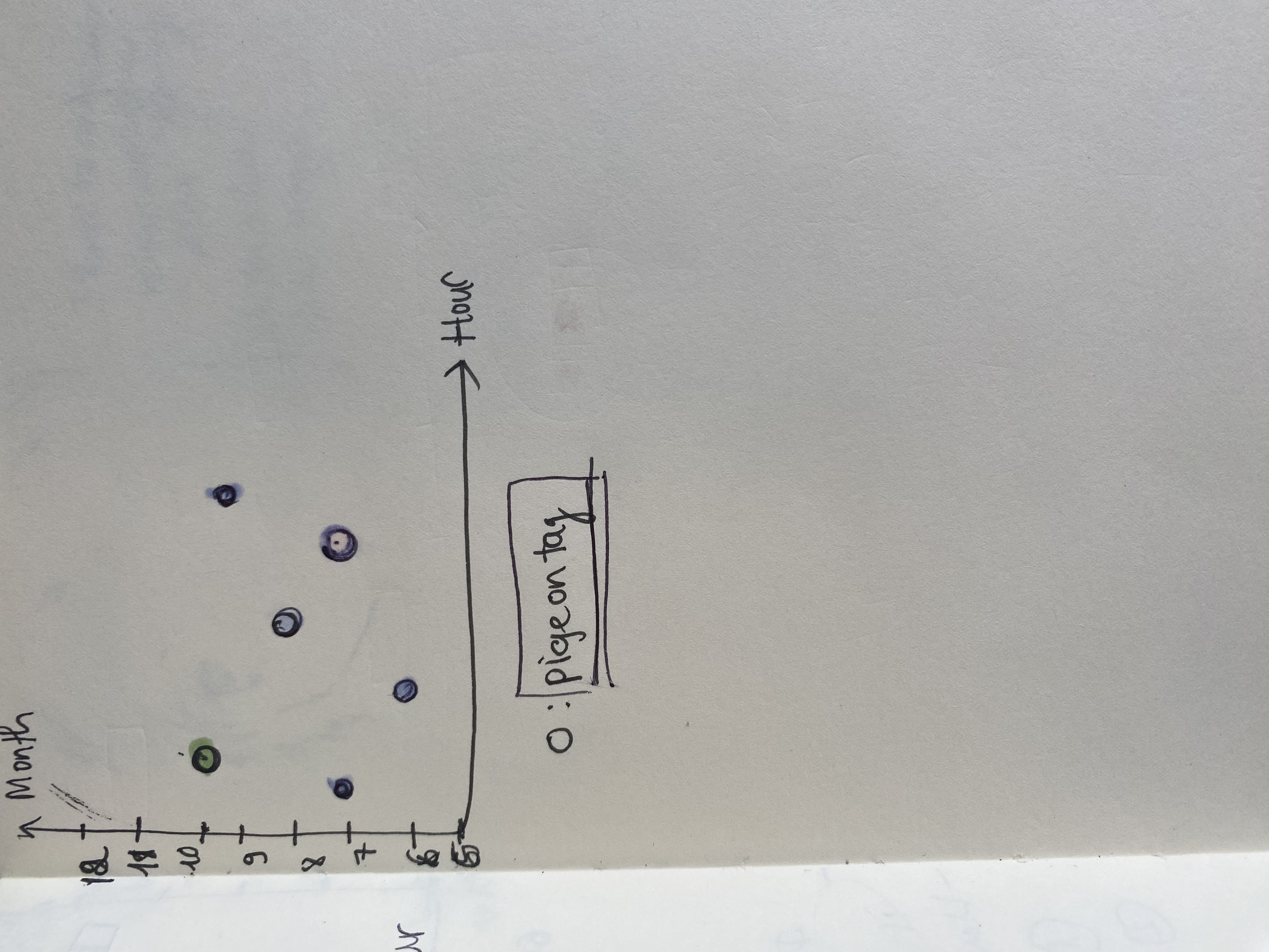
Action when click on each datapoint (left), choose circles for datapoint presentation (right)

To make the data point clean, I chose to use the circles instead of square shape for each point, but let users access the predictions or more data detail by clicking on the data

Feedback from the team

After showing the MVP below with feature to filter months and pigeon sound, I have received a few feedbacks and suggestions from the team:

  • Can we add the ability to link to the sound when we click on a datapoint?
  • Can we see more information about the data when clicking on the datapoint?

Updated Iteration

With the feedback and reflection on possible improvements, I choose these as the core features to iterate on:


  • Add an HTML element to the popover so users can listen to the sound in realtime
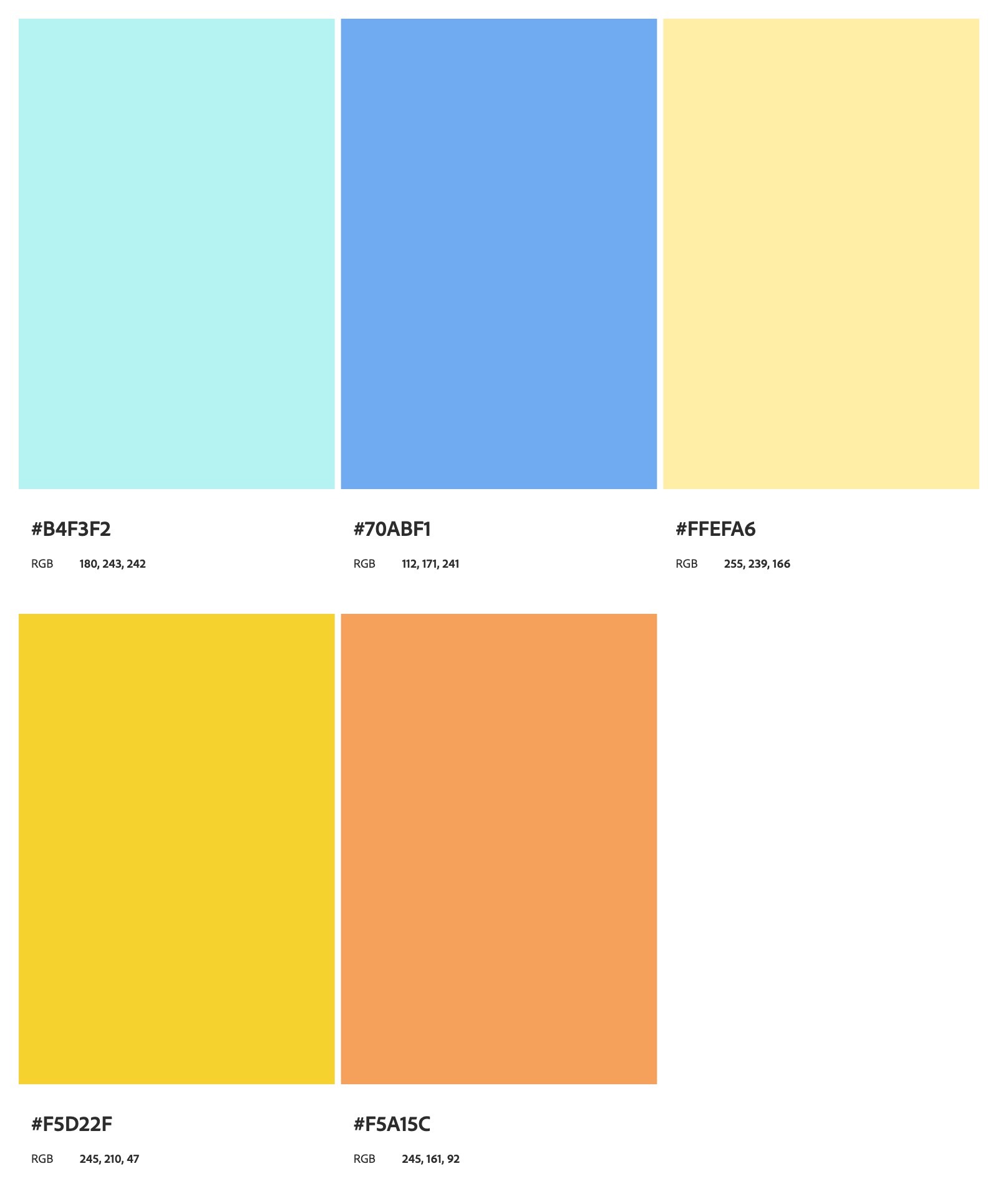
  • Redesign the datapoints to show confidence levels: since this is a project about ocean’s biological life, instead using green and red as confidence level as conventionally seen, I thought it would be refreshing to use blue and contrasting colors. After choosing and testing for accessibility on color.adobe.com, I finalized the palette as follows:
  • Color palette suitable with the theme of orca and ocean data

  • Add zooming and panning: a must for a very dense dataset
  • Finalize other design components (toggle button, drop down button) to be consistent with the design system and tabbable for better accessibility.

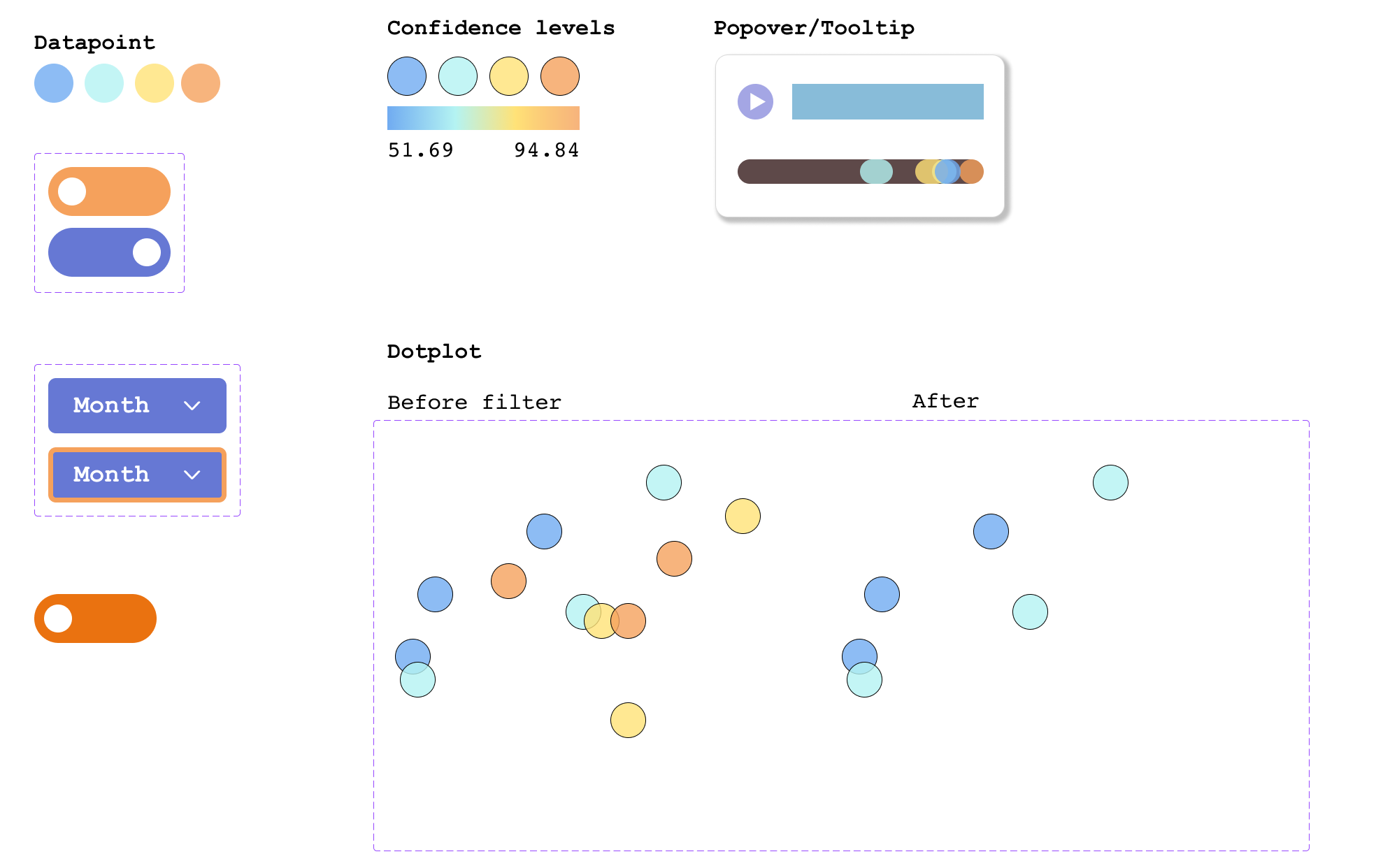
Design system with variants: toggle, dropdown with focus, data before and after filter

Updated implementation
Check out the design here and play with the interactive prototype!

Implementation

And finally, the product! I use d3.zoom() and update() to change the datapoint accordingly with some animation effects.


One of the challenges involved with the implementation includes making sure the timezone is in user's local time instead of UTC time as recorded in the dataset and making sure the data points have good enough contrast to see patterns

The most helpful feature, according to the team, is to be able to play the sound when we click on the datapoints, inspired from Scott's suggestion to add a link to the sound file.